Color Theory in Fashion Photography: Setting Mood and Style
Colors are powerful tools that can set the mood, define style, and evoke emotions in fashion photography. Whether you’re working with natural light outdoors or controlling every element in a fashion photography studio, knowing how to use color effectively can elevate your photos to new heights.
Let’s explore how you can harness the full spectrum of colors to create images that are not only visually striking but also emotionally compelling. We will focus on the details of color theory, exploring how different color models, including subtractive and additive color mixing, play a role in your work. From the basics of the color wheel and its primary, secondary, and tertiary colors to advanced techniques in color editing, this guide will help you master the art of color in fashion photography.
Understanding Color Theory
Color theory is the study of how colors interact and combine to create visually appealing results. This blend of science and art is essential for photographers, designers, and artists looking to use color effectively. Historically, the concept of color theory has been shaped by pioneers like Isaac Newton and Johann Wolfgang von Goethe. Newton, the brilliant physicist, was the first to conceptualize the color wheel in the 17th century. He discovered that white light could be split into a spectrum of colors using a prism, laying the groundwork for understanding how different colors relate to each other. Johann Wolfgang von Goethe, a German writer and artist, further developed these ideas in the 18th century by exploring the emotional and psychological impacts of colors.
Color perception is both a physical and psychological phenomenon. Physically, colors are seen when light hits an object and is reflected back to our eyes. Psychologically, colors can evoke various emotions and responses. For example, warm colors like red and orange often evoke feelings of warmth and excitement, while cool colors like blue and green can create a sense of calm and tranquility. Understanding this dual nature of color is crucial for a fashion photographer aiming to set a specific mood or style in their work.
What is a Color Wheel?
The color wheel is a circular diagram that displays the relationships between different colors. It’s a vital tool for understanding and applying color theory in fashion photography. The wheel is typically divided into three main categories: primary, secondary, and tertiary colors. Primary colors—red, blue, and yellow—are the building blocks of all other colors and cannot be created by mixing other colors together. Secondary colors—green, orange, and purple—are created by combining two primary colors. For example, mixing blue and yellow gives green. Tertiary colors are created by mixing a primary color with a secondary color, resulting in hues like red-orange, yellow-green, and blue-violet.
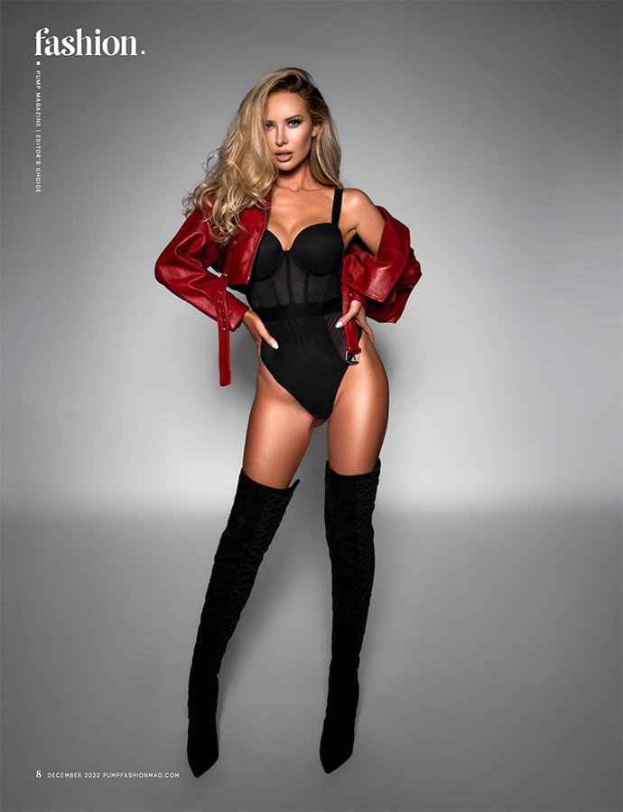
Practical applications of the color wheel in fashion photography are numerous and varied. For instance, using complementary colors, which are opposite each other on the color wheel, can create a striking and dynamic look. Imagine a photo where the model is wearing a bold red dress against a lush green background. The contrast between the complementary colors makes the model stand out, creating a powerful visual impact.
A triadic color scheme involves three colors that are evenly spaced on the color wheel, like red, yellow, and blue. For exanple, a model in a red dress, a yellow background, and blue accent props. The triadic scheme ensures that each color stands out and complements the others.
How to Use Color Combinations
When using the color wheel in fashion photography, start with one dominant color. Choose a main color and then find complementary or analogous colors to create a balanced look. Experimenting with tints and shades—by adding white or black—can add depth and variety to your photos.
Props and backgrounds play a crucial role in enhancing your color scheme. A well-chosen background color can make the subject pop, while props in analogous or complementary colors add interest and cohesion. Lighting also affects how colors appear in your photos. Natural light might enhance cool colors, while studio lighting can make warm colors more vibrant.
On a recent bohemian-themed shoot, we used a few earthy-toned props like wooden stools, woven baskets, and plants. These props complemented the natural, relaxed vibe of the outfits and added texture and interest.
For a more avant-garde shoot, you can use minimalistic, geometric props in bright, contrasting colors. The sharp, bold shapes and colors will add a modern, artistic flair. By understanding color schemes and color theory, you can effectively use one color or multiple colors to create visually captivating compositions.
See how to pick the perfect props for your fashion photoshoot here.
The Power of A Color Scheme in Fashion Photography
Setting the Mood
Colors have an incredible ability to evoke emotions and set the mood in fashion photography. This is why understanding and utilizing color psychology can make your photos more impactful. Each color carries its own emotional weight and can transform the viewer’s perception of the image. Using a color wheel to choose complementary or contrasting colors can further enhance these emotional effects.
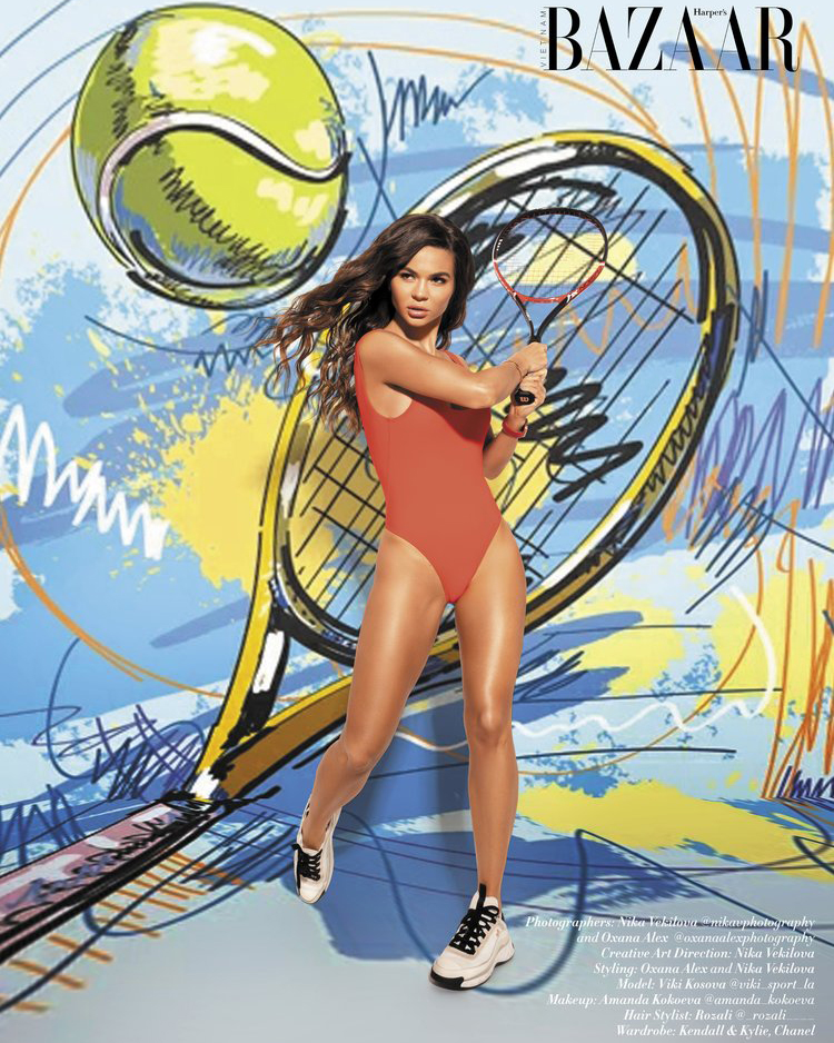
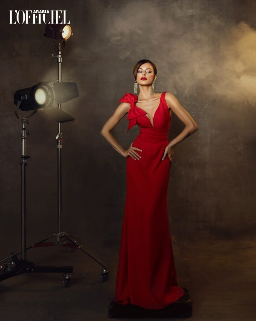
For instance, warm colors like red, orange, and yellow are often associated with energy, passion, and warmth. They can make a photo feel vibrant and lively. I remember a photoshoot where we were trying to capture a bold, confident look. We dressed the model in a stunning red dress and shot against an orange backdrop. The warm colors amplified the model’s fierce attitude and made the whole scene feel alive and energetic. This combination of colors is a classic example of how designers use color theory to evoke specific emotions.
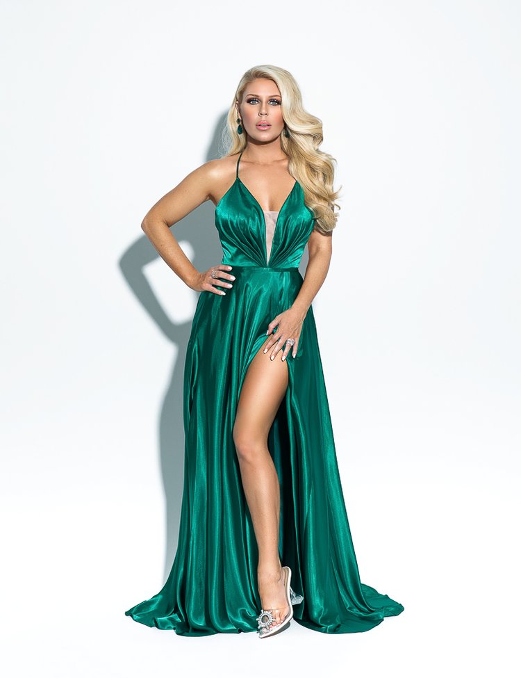
On the flip side, cool colors such as blue, green, and purple tend to evoke feelings of calmness, relaxation, and serenity. I once did a beach photoshoot early in the morning, with the model dressed in various shades of blue. The natural blues of the ocean and sky, combined with her attire, created a serene and tranquil atmosphere. The cool colors made the images feel peaceful and dreamy. This is a great example of using a specific color palette to create a desired mood.
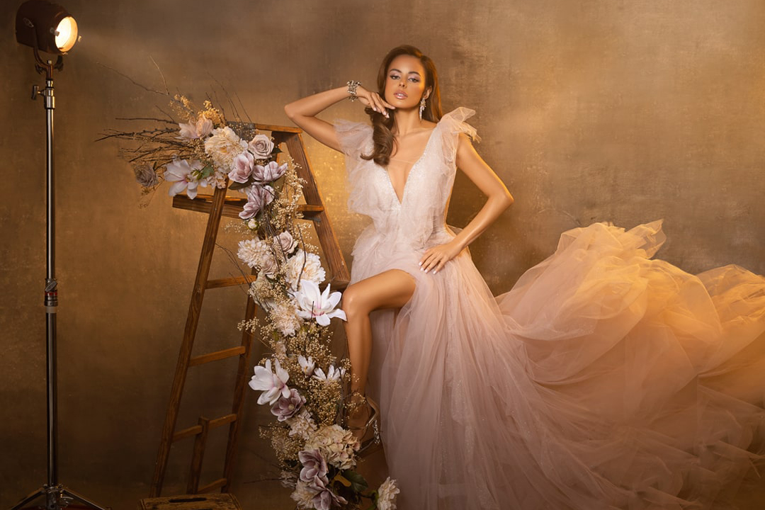
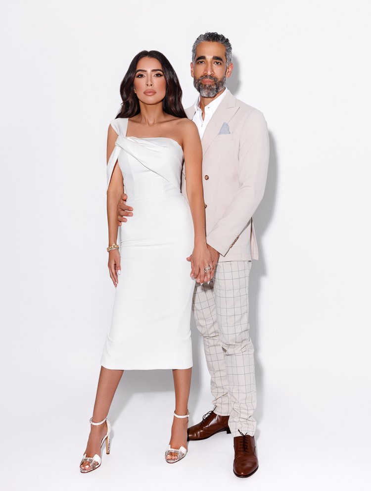
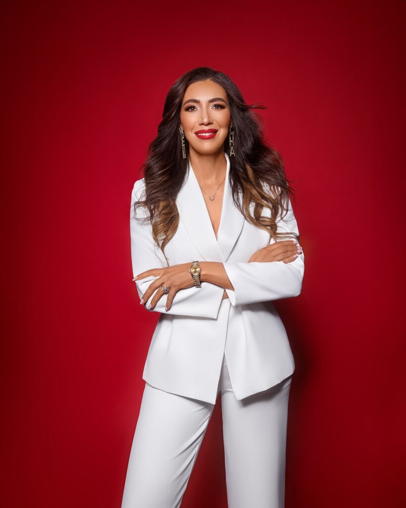
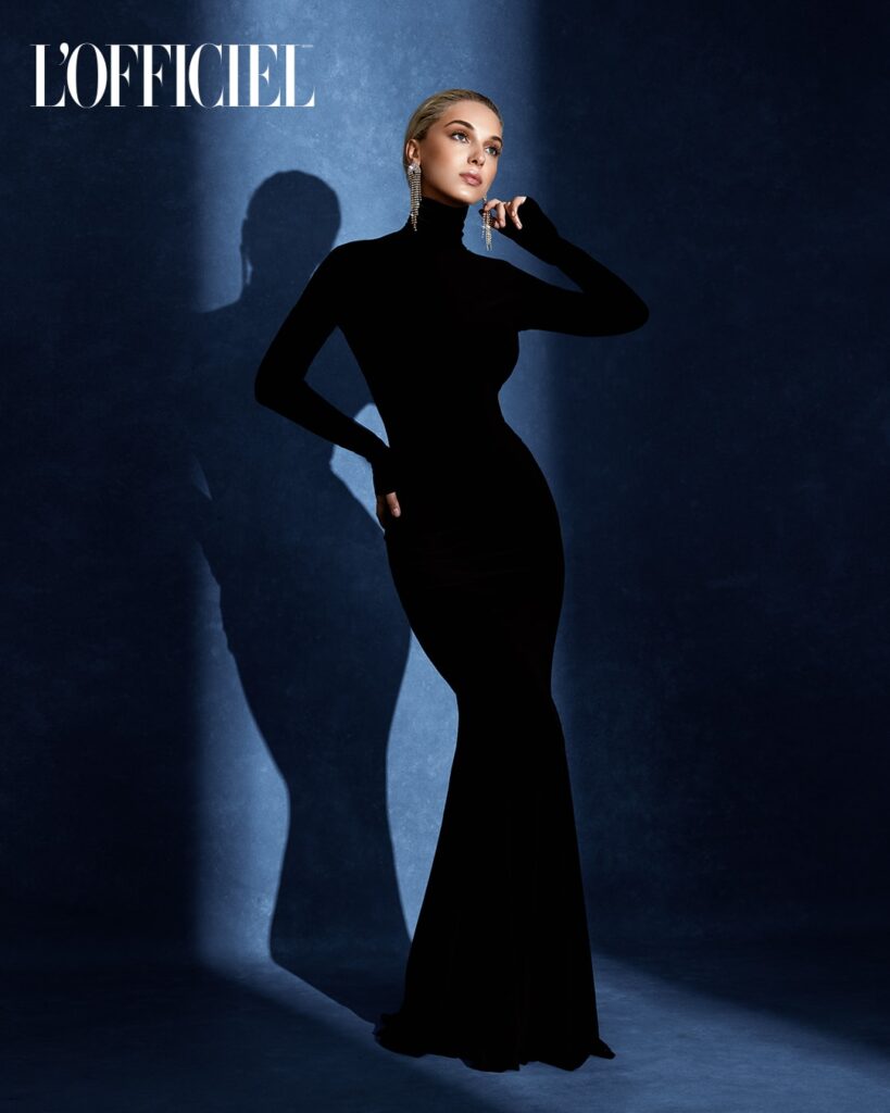
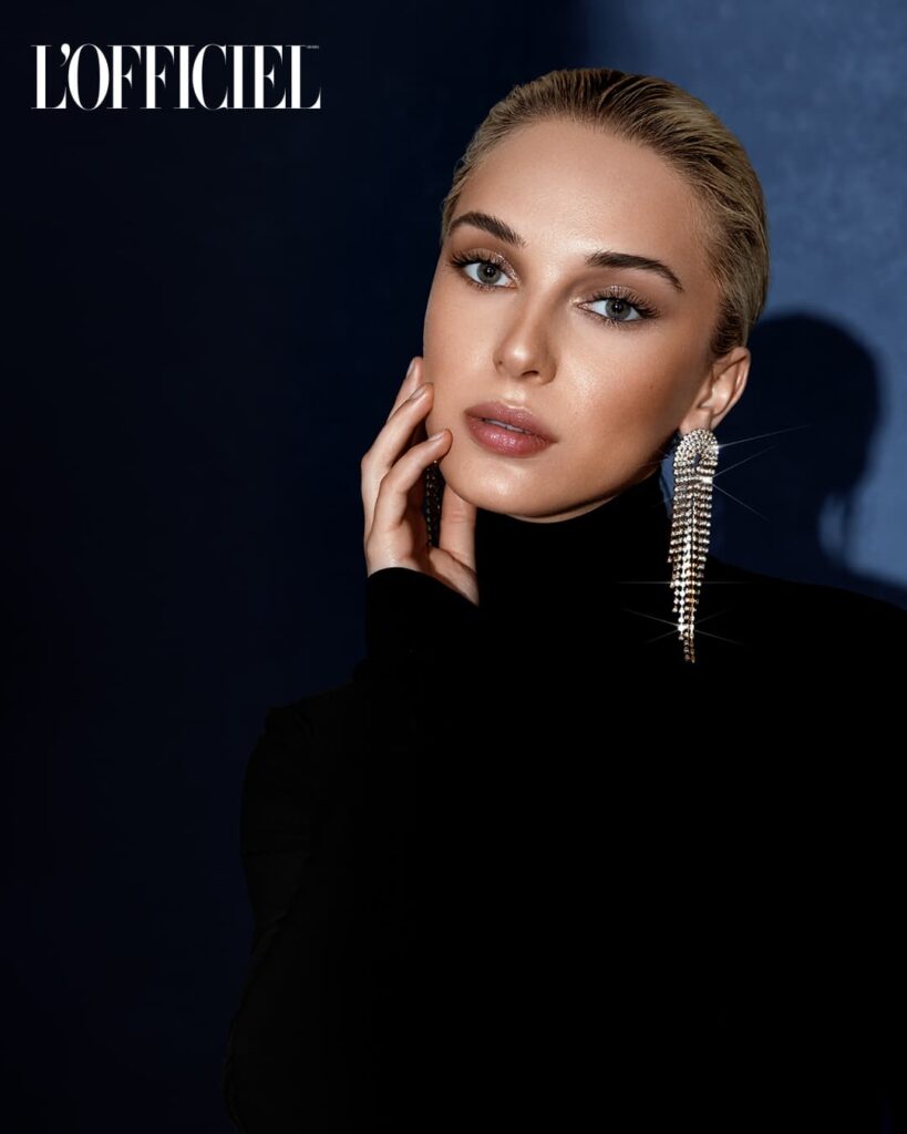
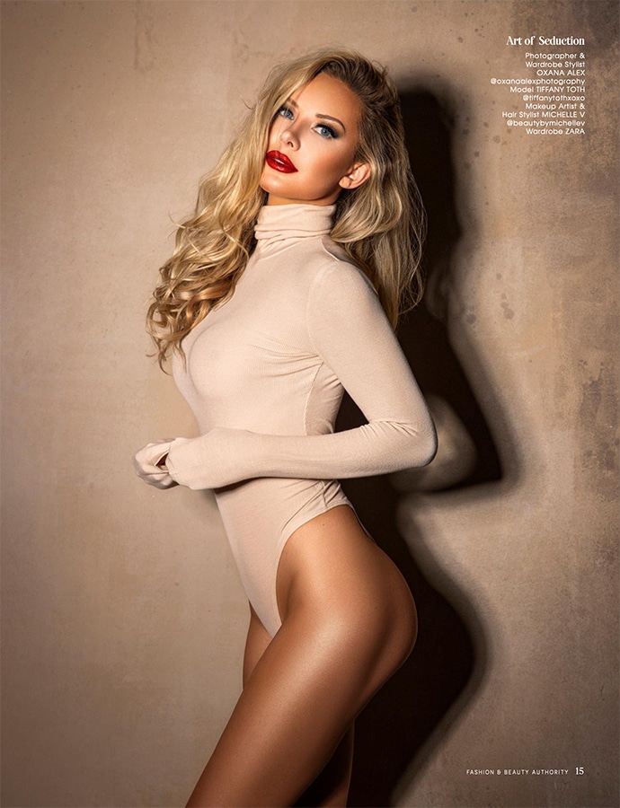
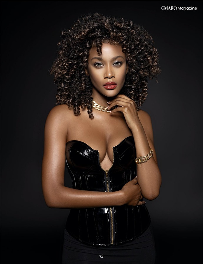
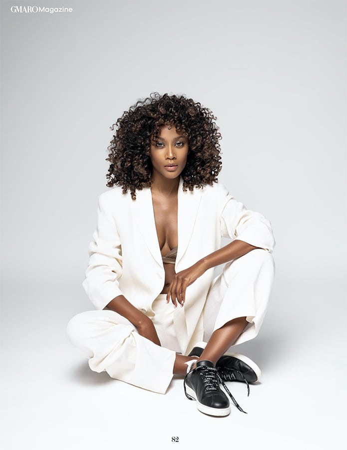
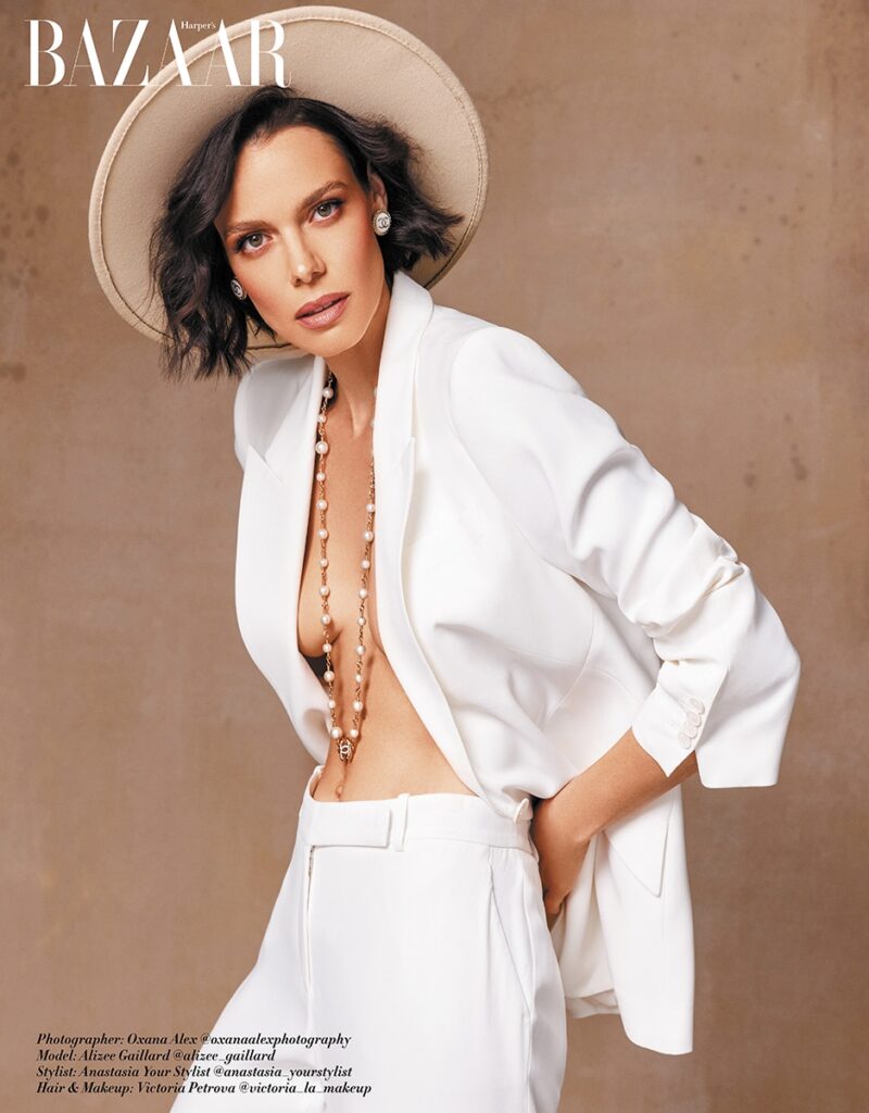
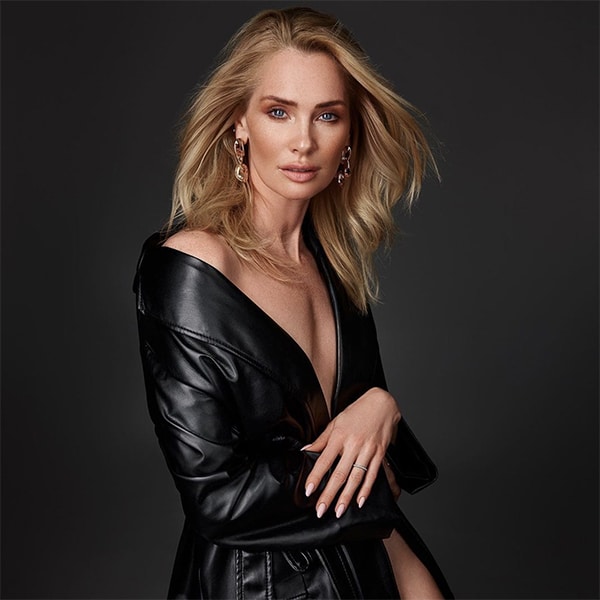
It’s also important to consider neutral colors like black, white, and grey. These colors can either tone down or accentuate the mood depending on how they are used. For example, a black background can make bright colors pop and add a touch of sophistication, while a white background can create a clean, minimalist look that feels fresh and modern. Neutral colors can also provide a conservative color base that allows other colors to shine without overwhelming the viewer. This approach follows traditional color theory principles, emphasizing the importance of balance and harmony in a composition.
Defining Style
Color is not just about setting the mood; it’s also a powerful tool for defining your unique style in fashion photography. Iconic fashion photographers often have a distinct color palette that makes their work instantly recognizable. Think of the rich, dramatic colors in the work of Mario Testino or the bold, contrasting hues used by Annie Leibovitz.
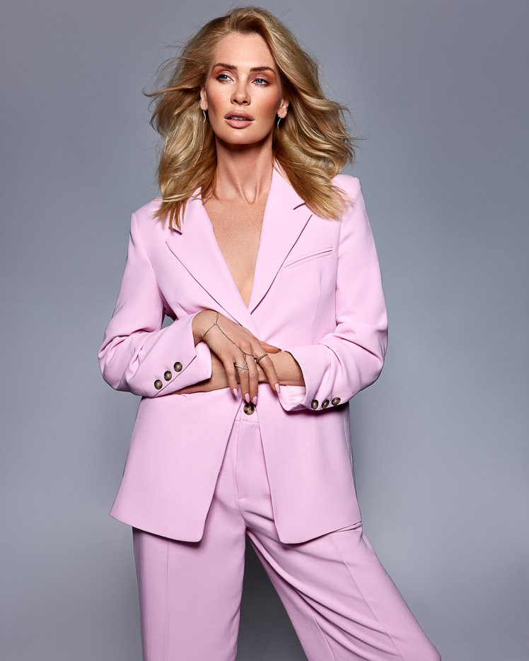
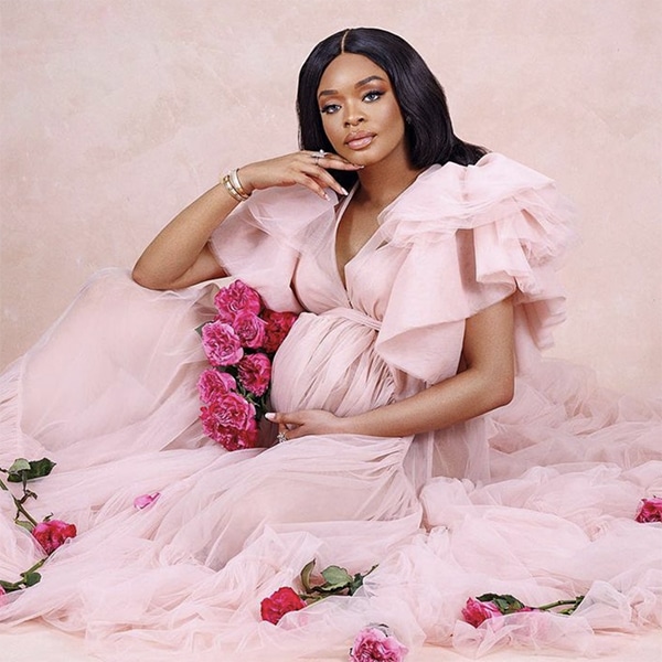
To create a distinct style with color, start by experimenting with different color palettes. For example, you might fall in love with the look of a monochromatic color scheme, where variations of a single color are used throughout the image. I once did a monochromatic shoot in shades of pink, from the backdrop to the model’s outfit and makeup. The consistency in color tied the entire image together and made it feel harmonious and stylish, illustrating the principles of traditional color theory and the RYB color model.
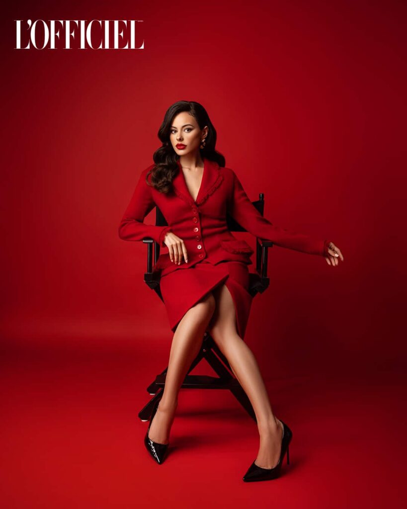
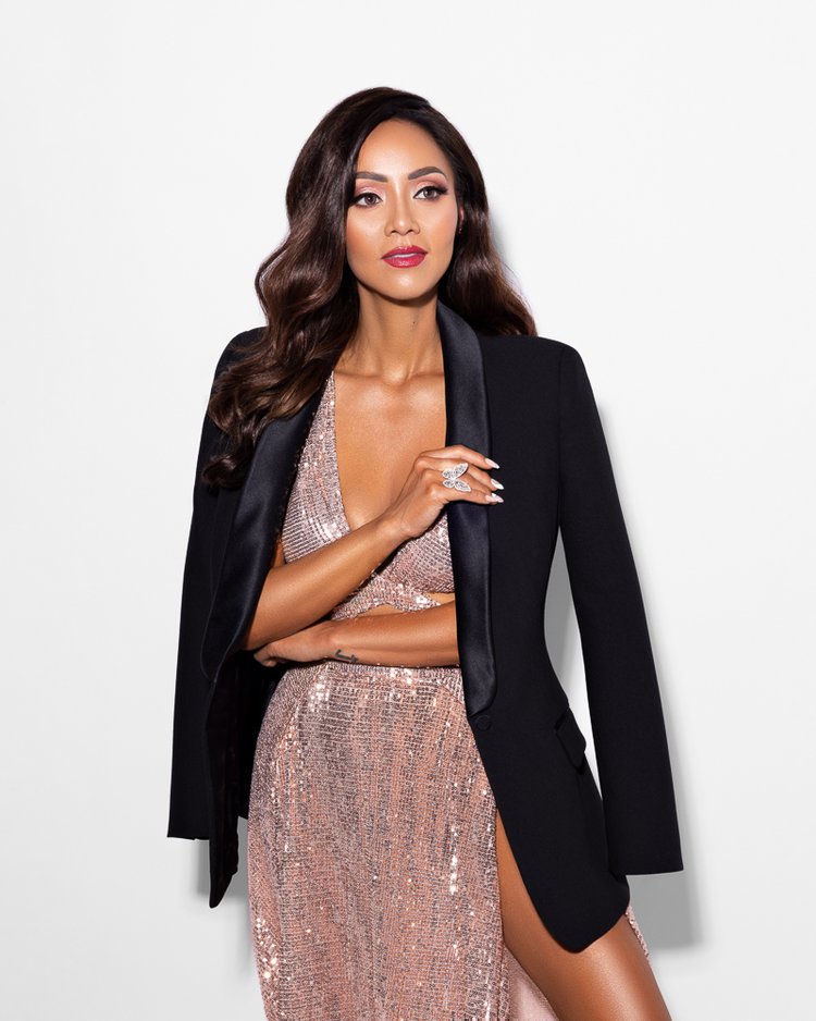
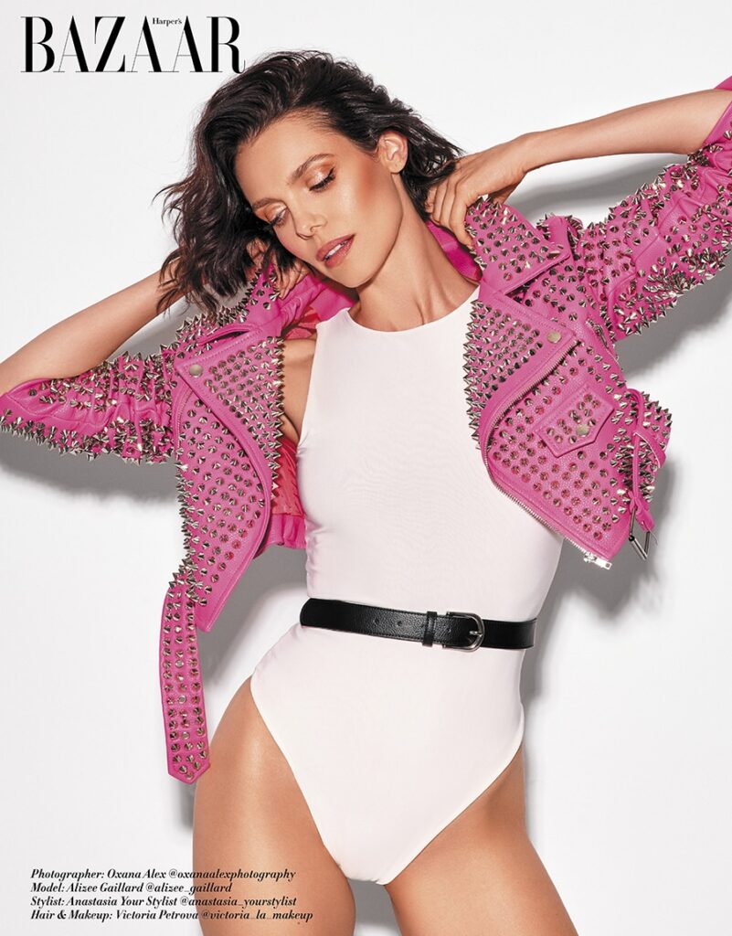
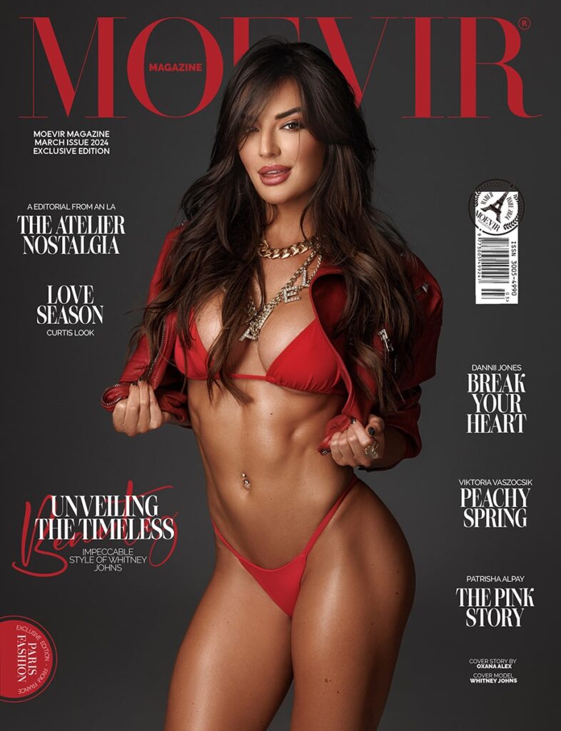
Another approach is to use a limited color palette, choosing two or three main colors to dominate your photos. This technique can help to create a strong, memorable visual impact. For instance, pairing teal and mustard can give a retro feel, while black and gold can evoke luxury and elegance. I had a fantastic experience shooting a high-fashion editorial where we used a black and gold color scheme. The opulent gold accessories and accents against the black outfits created a sense of sophistication that was truly striking. This use of color contrast is a classic example of how artists and designers use color to create visual impact.
Creating a mood board is another effective strategy. Collect images that inspire you and analyze their color schemes. This can help you see patterns and preferences in your own taste. Additionally, use color picker tools like Adobe Color to experiment with different color combinations and see how they work together. This can be particularly useful when planning a photoshoot, as it helps in developing a cohesive color vision. Sometimes, I’ll spend hours playing around with different combinations, tweaking the shades until I find the perfect balance!
Lastly, consider the context and the story you want to tell. Think about the emotions you want to evoke and choose colors that align with this vision.
Read more on how to tell a story through fashion photography here.
Color Psychology in Fashion Photography
The Meaning of Colors and Hues
Diving into the psychological effects of individual colors is like unlocking a secret language that can profoundly impact your work. Each color has its own set of emotional and psychological associations, which can be harnessed to convey specific feelings and messages in your photos.
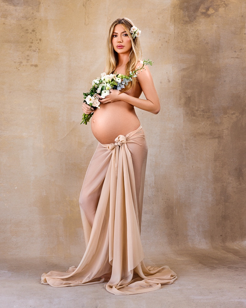
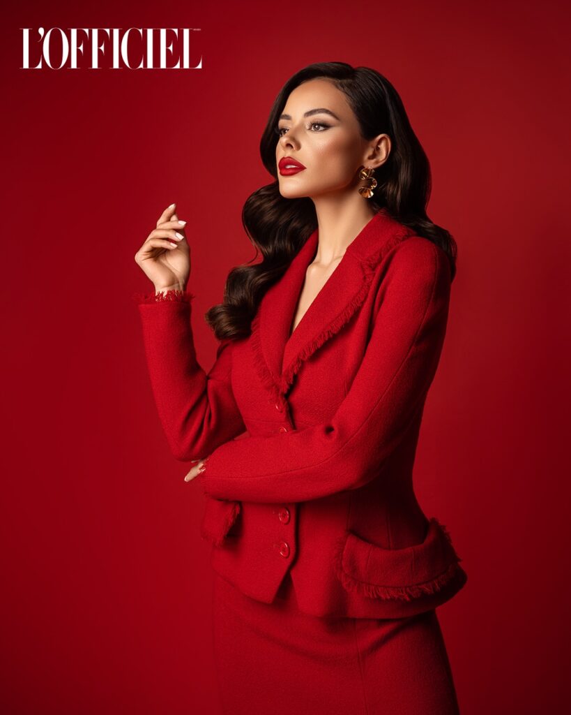
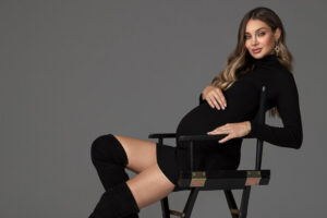
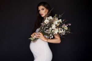
Red, for instance, is a color that screams passion, energy, and excitement. It’s a powerful hue that can instantly draw attention and evoke strong emotions. I once used red extensively in a maternity fashion shoot. The idea was to capture the strength and beauty of motherhood. We draped the expecting mother in a flowing red gown that cascaded around her, creating an aura of elegance and vitality. The vibrant red not only highlighted her confidence but also added a sense of celebration and anticipation to the images. The bold color choice made each photograph resonate with the powerful emotions of this special time in her life.
Using the theory of color and understanding color associations can significantly enhance the emotional impact of your images, making them more compelling and memorable.
Cultural Associations of Colors
Colors are not only powerful in their psychological effects but also in their cultural significance. Different cultures perceive colors differently, and these perceptions can add layers of meaning to your fashion photographs.
Take, for example, the color yellow. In many Western cultures, yellow is associated with happiness, sunshine, and energy. It’s a bright, cheerful color that can bring a sense of joy and positivity to an image. However, in some Eastern cultures, yellow can also symbolize royalty and power. In China, for instance, yellow is considered the most beautiful and prestigious color, often associated with the emperor and imperial family. Understanding these nuances can help you use color more effectively in your work.
Another example is green, often associated with nature and growth in many cultures, symbolizing fertility, freshness, and harmony. However, in some Asian cultures, green hats can symbolize infidelity. This dichotomy can be crucial when planning a shoot. For example, if you’re shooting a collection that emphasizes eco-friendliness and natural materials, green is a perfect choice to highlight the theme of growth and renewal. On the other hand, you might want to avoid it in contexts where its negative connotations could be problematic.
Blue also has varied meanings across cultures. In Western cultures, blue is often associated with calmness, trust, and stability. However, in Middle Eastern cultures, blue can be seen as a protective color, warding off the evil eye. This protective symbolism can add a layer of depth to your photos. For instance, if you’re shooting a collection inspired by Middle Eastern fashion, incorporating shades of blue can not only highlight the beauty of the garments but also convey a sense of safety and tradition.
Tips for Picking the Best Color Palette for your Photo Shoot
Before a shoot, take the time to understand the cultural significance of the colors you plan to use. If you’re working with models or clients from diverse backgrounds, ask them about their preferences and any cultural considerations related to color. This thoughtful approach to color not only shows respect but also can set your work apart by helping you create images that are both beautiful and meaningful.
See creative techniques from a fashion fashion photographer.
Practical Application of Color Theory
Choosing the Right Color Scheme
Choosing the right color scheme for your fashion photoshoot can make all the difference in how your images are perceived. The type of color scheme you choose sets the foundation for the mood, style, and overall impact of your photographs. There are several types of color schemes you can explore, each bringing a unique flair to your fashion photography.
A monochromatic color scheme uses variations in lightness and saturation of a single color while analogous color schemes involve colors that are next to each other on the color wheel, such as blue, blue-green, and green. These combinations are harmonious and pleasing to the eye.
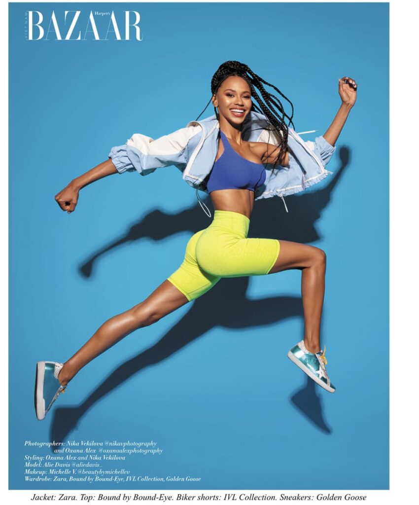
Complementary color schemes use colors that are opposite each other on the color wheel, such as blue and orange or red and green. I remember a photoshoot where the model wore a striking orange dress, and we used a deep blue backdrop. The contrast between the complementary colors made the images pop, adding a sense of energy and excitement.
Creating Harmony with Color
The concept of color harmony revolves around choosing colors that work well together and complement each other. This can be achieved through various schemes like triadic, tetradic, and split-complementary.
A triadic color scheme uses three colors that are evenly spaced around the color wheel, such as red, yellow, and blue. This scheme offers a vibrant and balanced look. In a recent studio shoot, we aimed for a fun and lively atmosphere. We chose a triadic scheme of purple, orange, and green. The model wore a purple dress, with orange and green props scattered around the set. We used soft, diffused lighting to ensure the colors were vibrant but not overpowering. The resulting images were playful and dynamic, each color complementing the others beautifully, showcasing the principles of the color spectrum and traditional color theory.
A tetradic color scheme, or double-complementary scheme, involves four colors arranged into two complementary pairs. This can create a rich and diverse palette. For an editorial shoot, we used a tetradic scheme of red, green, blue, and orange. The model’s wardrobe included a mix of these colors, and we used a combination of blue and green backdrops with red and orange accessories. The lighting was set to highlight the contrasts without creating harsh shadows. This careful balance of colors and light resulted in images that were visually striking and full of depth, demonstrating how to develop a color scheme based on multiple colors and their interactions.
Split-complementary schemes use a base color and the two colors adjacent to its complement. This approach provides strong visual contrast while maintaining harmony. In a fashion shoot inspired by autumn, we used a split-complementary scheme with yellow as the base color, complemented by shades of blue and purple. The model wore a mustard yellow outfit, and we used blue and purple props and background elements. The warm studio lighting enhanced the autumnal feel, making the colors rich and inviting. This method highlights how to find color harmonies and create appealing contrasts using the color wheel.
Achieving color harmony in your photoshoots involves more than just picking colors that look good together. It’s about considering every element in the frame, from the wardrobe and props to the lighting and poses. In one of my shoots at my Los Angeles photography studio we focused on pastel colors and used a triadic scheme of pastel pink, mint green, and baby blue. The model’s outfit was a delicate pink dress, and the backdrop alternated between mint green and baby blue. Soft lighting was crucial to maintain the pastel hues’ gentle nature. We also posed the model in ways that complemented the flowing lines of the dress, ensuring the colors remained the focal point without distraction.
The color process in creating these harmonious images often involves subtractive color mixing, especially when working with printed materials or painted backdrops. Understanding the interplay between colors and how they can be mixed and balanced using subtractive color models, which involve the three primary colors, three secondary colors, and six tertiary colors, can enhance your ability to create stunning visuals. By diving into color theory and experimenting with different combinations, you can find the perfect color harmonies to elevate your fashion photography.
Studio Photography
Lighting and Color Temperature
One of the biggest benefits of studio photography is the ability to control the lighting and color temperature. Lighting can profoundly affect color perception, making the same color look different under various conditions. Understanding how to manipulate light in the studio helps you achieve the perfect mood and style for your shoot.
Color temperature refers to the warmth or coolness of the light, measured in Kelvin. Warmer light, around 3000K, emits a yellowish hue, like a cozy evening glow. Cooler light, around 5600K, mimics daylight with a bluish tint. Adjusting the color temperature can dramatically change the atmosphere of your photos.
In a studio, using softboxes and LED panels allows precise control over color temperature. For example, if you have a winter fashion shoot, aim for a warm, inviting feel by setting the color temperature to a warmer tone around 3200K. This creates a golden, intimate atmosphere, making the rich textures and deep colors of the winter fabrics pop. The lighting will also soften the shadows and add a glow to the model’s skin.
For a high-fashion editorial with a futuristic theme, opt for a cooler color temperature around 6000K. The bluish light will complement the metallic fabrics and sleek designs, giving the photos a modern, edgy look. Using gels to add color to your lights is another technique. For example, a blue gel can enhance cool tones, while a red gel can bring out warmth and intensity. Use both together, and you’ll have some pretty creative shots!
Advanced Techniques in Color Editing
Post-processing allows you to refine and enhance the colors in your photos, ensuring they look exactly as you envision. The right software and tools can make a significant difference in achieving the desired effects. Some of the most popular tools for color correction and enhancement include Adobe Lightroom and Capture One.
In Adobe Lightroom, start by adjusting the white balance to ensure your colors are accurate. This can be done using the temperature and tint sliders. Next, move to the HSL (Hue, Saturation, and Luminance) panel, where you can individually tweak the colors. For instance, if you want to make the blues in your photo more vibrant, increase the saturation of the blue tones. If you need to tone down a particularly bright red, reduce its saturation and adjust the hue to find the perfect balance. This process helps you achieve great color accuracy, ensuring that each hue is as vibrant or subdued as you intend.
Photoshop and Capture One offer even more advanced tools for color editing. Use the Curves adjustment to fine-tune the contrast and color balance. By manipulating the curves for the red, green, and blue channels individually, you can achieve a precise color correction. The Selective Color adjustment is another powerful tool, allowing you to adjust the amount of each primary color within a specific range of colors in your photo. This can help you subtly enhance or completely transform the color palette of your image. These techniques are crucial for color reproduction, ensuring the original colors are faithfully represented in the final image.
One tip is to use the Color Lookup adjustment in Photoshop, used a lot in graphic design as well, this applies different color grading presets to your photo and can be a quick way to experiment with various looks and find inspiration for your final edit. Just remember, subtlety is key in color editing. It’s easy to go overboard, but often, less is more as gradual adjustments tend to look more natural and pleasing to the eye.
Color Grading for Mood and Style
Color grading is a powerful technique that goes beyond basic color correction, allowing you to define the mood and style of your final image. It involves adjusting the overall color palette and tone to create a specific atmosphere or emotional response. For example, a warm, golden tint can evoke a nostalgic, vintage feel, while cool, desaturated tones can create a modern, minimalist look. This is a key aspect of the theory of color and color theory and color applications.
In one of my recent projects, we aimed for a dreamy, ethereal mood. After the basic color corrections, I applied a soft pink and blue tint using the Split Toning feature in Lightroom. By adding a pink tone to the highlights and a blue tone to the shadows, I achieved a cohesive, romantic look that perfectly matched the theme of the shoot. The key to successful color grading is to enhance the story and emotion you want to convey through your images, leveraging the color spectrum to its full potential.
Another effective color grading technique is the use of LUTs (Look-Up Tables). LUTs are pre-set color profiles that can be applied to your photos to give them a specific look. They are widely used in both photography and filmmaking. By experimenting with different LUTs, you can quickly see how various color schemes and tones affect the mood of your image. This can be a great starting point for developing your own unique color grading style.
Start by studying the works of photographers and filmmakers you admire. Analyze how they use color to evoke emotions and set the scene. Experiment with different techniques and tools, and don’t be afraid to create your own presets and LUTs. Over time, you’ll develop a signature look that will make your work instantly recognizable.
Oxana Alex – Fashion Photographer Los Angeles
At Oxana Alex Photography, we are open for booking in studio fashion photography sessions. Our studio is located at 2100 Sawtelle Blvd UNIT 307 Los Angeles, CA 90025, USA. You can see our photoshoot pricing here & our photography reviews here.
Conclusion
Mastering color theory in fashion photography is about more than just knowing the right combinations of colors on the color wheel. It’s about understanding how colors interact, how they affect mood and style, and how to use them to enhance the story you want to tell. Whether you’re choosing one dominant color to make a statement or using a split complementary color scheme to create balance, the principles of traditional color theory are essential tools in your creative arsenal.
In the studio, controlling the color temperature and choosing the right backgrounds and props can significantly impact the final image. Techniques in color editing, such as using software for color correction and enhancement, allow for fine-tuning that perfect look. Understanding the psychological and cultural associations of colors can add layers of meaning to your photos, making them more relatable and impactful.
The ability to manipulate colors through additive and subtractive mixing, understand the primary color palette, and effectively use accent colors can set your work apart. By diving into the rich world of color theory, from the basics of the first color wheel by Isaac Newton to modern color theory applications, you can transform your fashion photography and create images that not only capture the eye but also touch the heart, leaving a lasting impression on your audience.
How do I schedule my session?
You can schedule your session by emailing [email protected] or by texting our studio at (310) 854-9695.